Can Your Business Afford to Ignore Web Accessibility?
Here's Why Designing for All Users Is a Must
By Diana Jordan, Assistant Digital Media Editor, Media/Communications Department
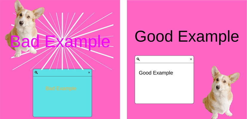
 Have you ever clicked on a website link that led to an intensely bright background, neon-colored text, and distracting images placed aimlessly on the page? You may have found it hard to read, but for people with neurological disabilities, visual impairments, and more, this type of display can be overstimulating and nearly impossible to understand. In the United States, the Americans with Disabilities Act (ADA) governs website accessibility for people with disabilities. Specifically, ADA outlines that any person or organization must make their website readily accessible and useable by individuals with disabilities if used by the public. It is for this reason that web accessibility has become a hot topic of discussion in the United States, and why businesses around the country must begin adapting web accessibility measures.
What is web accessibility?
According to the World Wide Web Consortium (also known as W3C), web accessibility includes strategies, standards, and resources to make the Web accessible to people with disabilities. In other words, web accessibility allows people with disabilities to understand, navigate, and contribute to the Web.
Why is web accessibility important?
Having an accessible website can strengthen your brand, enable you to reach a broader audience, and optimize your SEO and usability, especially since one in four people in the U.S. has some form of disability, according to the Center for Disease Control. For your business or organization to reach every possible economic segment, your digital presence should be accessible to all consumers. If not, you could lose entrée to a whole market sector of people who may not be able to read text, watch videos, or easily purchase products on your website – and individuals with disabilities have immense buying power! But having an accessible website is not only important for earning additional income – it’s the law! In fact, several well-known corporations – including Netflix, Domino’s Pizza, Amazon, and more – have been sued in the past because their websites were inaccessible.
Why is Kessler Foundation striving for accessible content?
Kessler Foundation envisions a world where people with disabilities can achieve the greatest possible independence, pursue integrated, competitive employment, and live with dignity within our communities. The Foundation recently joined the International Association of Accessibility Professionals, an organization that supports accessibility professionals with training, certifications, and networking.
Several ways to improve accessibility
If you realize parts of your website are inaccessible, here are a couple of easy improvements to make initially:
Alternative text: Alternative text (alt text) describes the content of images, graphs, and charts. Adding alt text offers people with vision impairments the ability to understand the graphics on a site. Including a short yet informative description can help the user picture the colors, objects in the image, or how a person looks in a photograph. Visit an alt text tutorial from Harvard.edu.
 Type font: There is no definitive answer regarding which font is the most accessible. However, certain factors make a typeface inaccessible to some people. Fonts with extremely thin strokes, or unique characteristics that make their letter forms unfamiliar tend to be more challenging to read, particularly when the contrast levels are low. Sans-serif fonts – such as Verdana, Tahoma, and Arial – are often recommended because their appearance is more block-like and less ornamental, making them slightly more readable than serif fonts. You can learn more about which fonts to use at Accessibility.com.
Color contrast: Colors are crucial to creating accessible designs. The background color of your website should be a strong contrast to your overlaying, foreground text for legibility. Beware of combining colors that are indistinguishable from each other, such as a hot pink background with light pink text, or combinations that color-blind individuals may not be able to read. For example, avoid using red on green, yellow on green, green on yellow, or red backgrounds with black, blue, or magenta. Read more about color contrasts on the web at webaim.org.
For more information on universal design, read the article “Guidance on Web Accessibility and the ADA.”
